cornwall medium format

New Kodak Gold 120 200 review

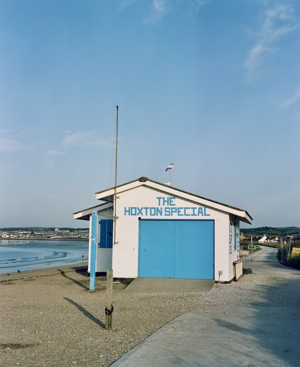
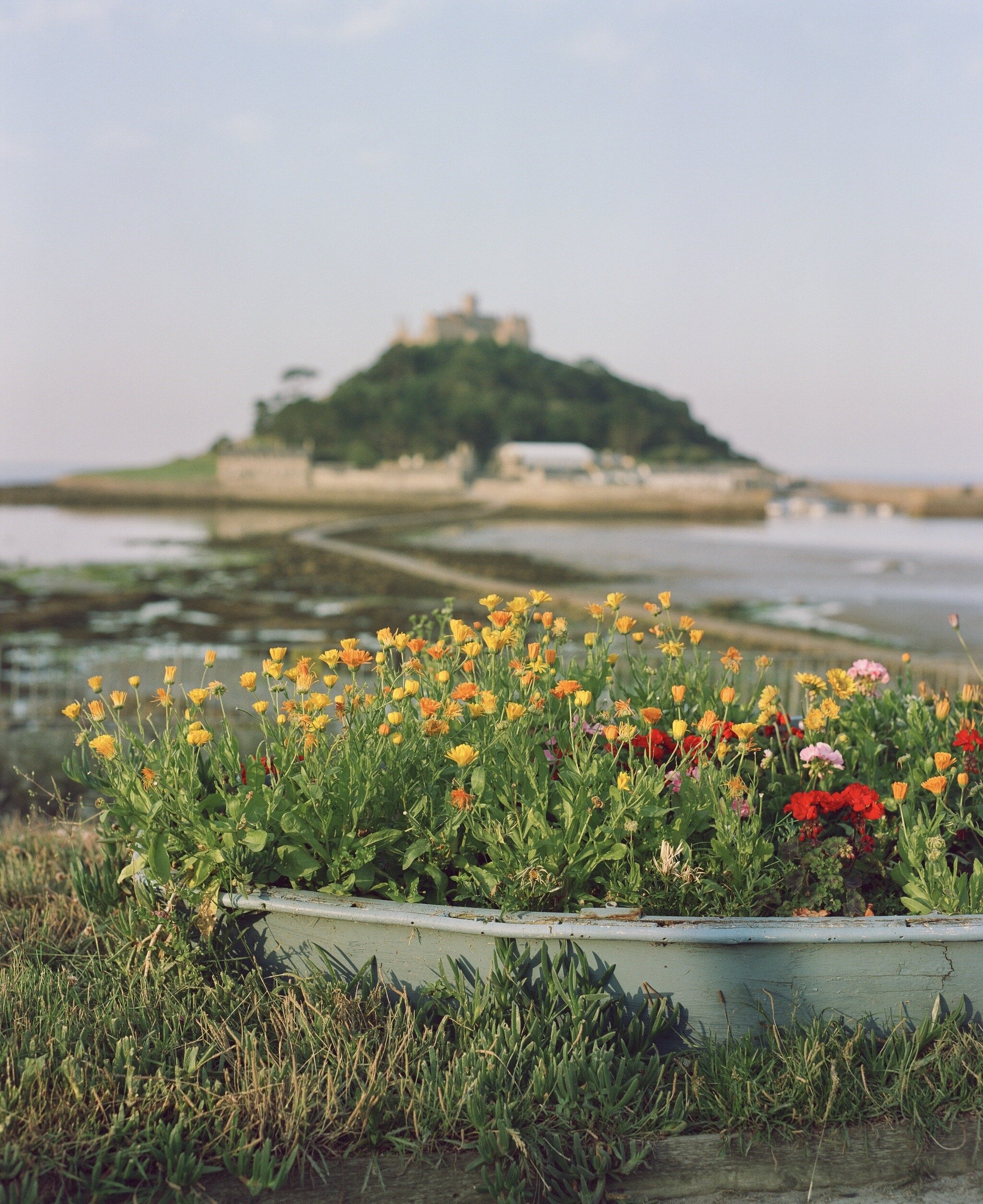
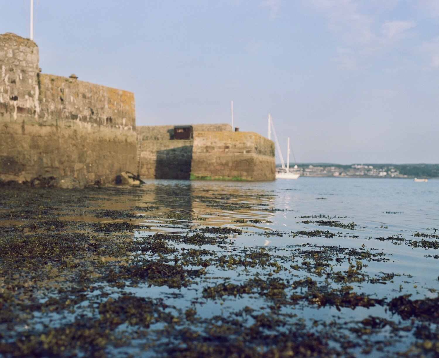
Since the recent launch of the new Kodak Gold 120 stock, Ive been looking for an appropriate subject matter to shoot it with, both on 6x6 and 6x7. Colour wise for me , Cadgwith fits the bill 100%. It’s one of those quintessential colourful Cornish fishing villages that has it all. Granite old school Cornish cottages, thatched roofs, pastel coloured boats, glorious views and the Atlantic ocean pushing into its sheltered cove

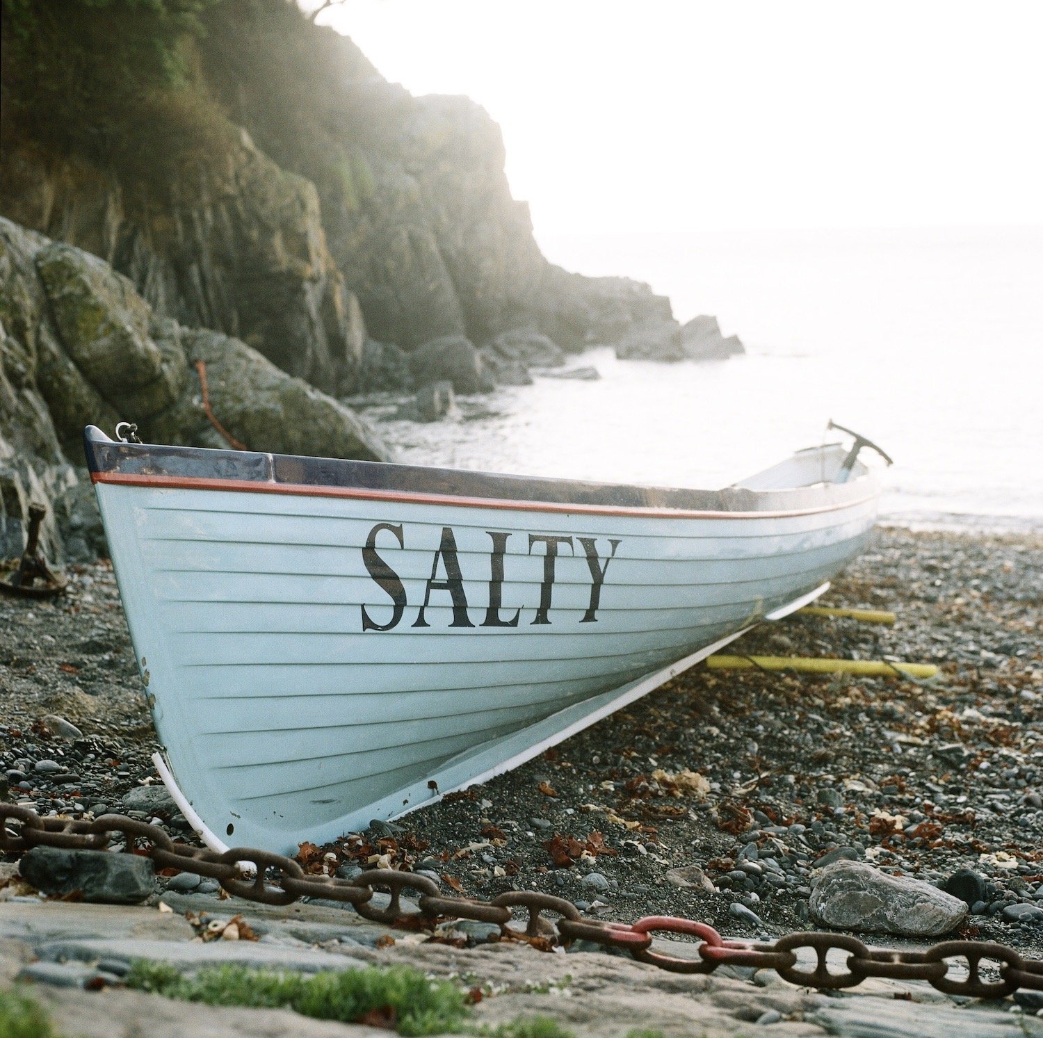
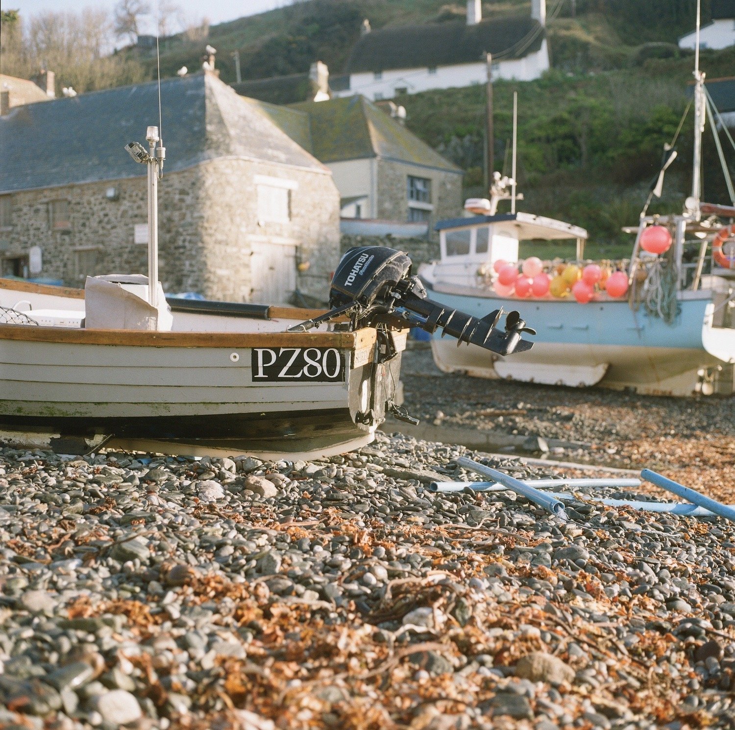
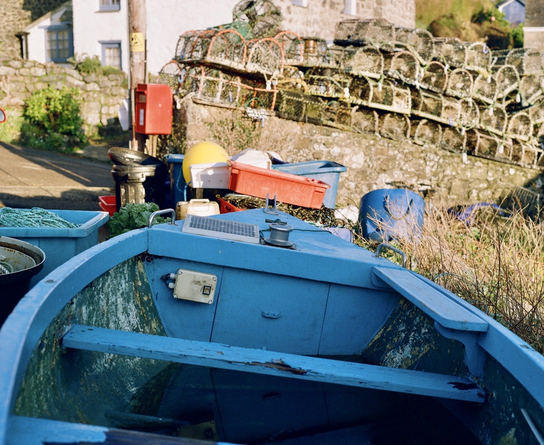
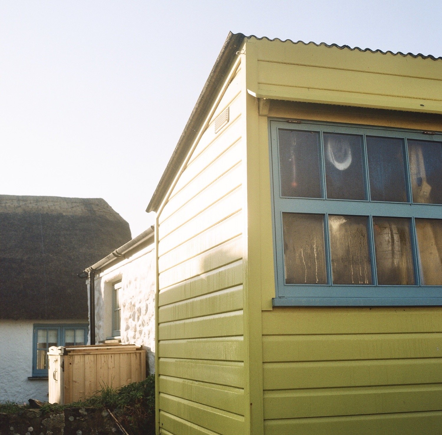
The colours look great for me and Cadgwith certainly delivered on the colour front. Early doors is always the best time to shoot these locations. On reflection, Im pretty happy with Kodak Gold

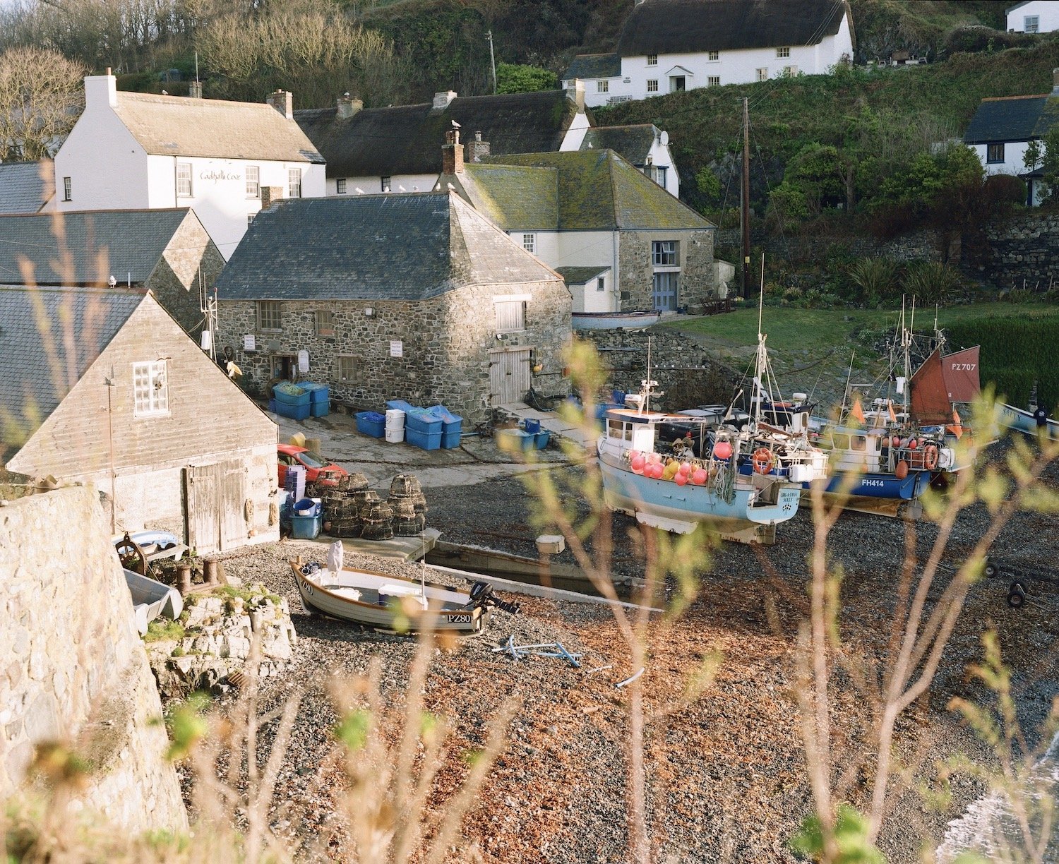
The new Kodak Gold 120 seems to sit somewhere between Portra 160 and Ektar I reckon. Maybe not so vivid perhaps as Ektar and not so neutral as Portra but the colours do pop for me, and Cornwall always delivers on the colour front which makes my job so much easier. By the way, Im no expert or a technical photographer in any way but these are my findings, results and my review.

Camera’s used in this shoot: Hasselblad 500 CM/ Asahi Pentax

no PS, LR. Presets, just straight out of the camera at box speed

Please note: other views and opinions are available but these are mine

Kodak Professional Portra 160NC review

Here’s a Kodak film stock that I only came across recently and being a lover of Portra in general, I simply had to try it.
I shoot a lot of Portra both on 35mm and medium format but I wanted to try NC on my 6x7 first, just to gauge it on a large negative fit. By the way, this roll of NC expired back in 1998.
I first picked a solid colour subject matter to see how it stood up. You’ll notice here that there is four blues, the double doors, the side shutter, the sea and the sky. All different shades of blue. To my eyes, there’s not colour separation at all and NC has performed really well given the fact that its over 20 years old

The next image was shot early doors just as the sun was coming up positioned slightly behind me. I picked this frame as I thought it would best represent a series of colours for a decent Portra test. Again, I think the film stood up really well the colours to me are classic Portra, perhaps more 160 than 400

medium+format_film_cornwall_rick_davy.jpeg

I think it’s important to note here that I don’t use Photoshop, Lightroom or filters. I still struggle to understand that if you’re shooting film, you take all that time to compose the shot, get your light levels, shutter speed etc, you then take that image and change it, add and manipulate the hell out of it. If you shot it wrong in the first place, go back and do it again or learn from your mistakes.

Again, the colours here for a well expired film look really good and they are as I saw them. Clearly previous storage on his roll has been good or at least been kept away from heat etc.
On balance then, If i can get hold of some more of this stock, I certainly would. Its clearly Portra both on the quality and the colour front.

Please note: Other views and opinions are available but these are mine. Cheers….